Ghost themes for newsletters
Give every edition somewhere to live. Connect the inbox with an archive readers can enter at any point.
An edition keeps working after it leaves the inbox. On the site, earlier writing can introduce the newsletter to a new reader and carry one issue into the next.
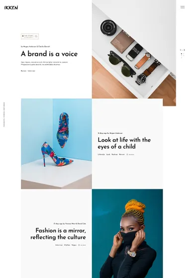
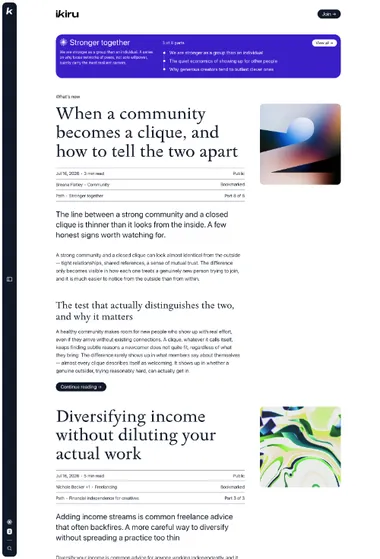
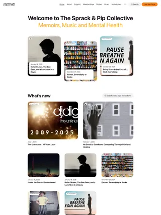
Ikiru. Turn separate editions into a sequence. Paths and extended previews let readers enter the newsletter through an idea, then follow it across several issues.
Extended previews bring a chosen passage onto the homepage, so a new visitor can meet the voice before opening an edition. Featured posts and Paths become landmarks in the flow, while images can support the writing from a quieter position.
A Path gathers related editions beneath one introduction and places them in a visible order. The side panel keeps series, navigation, and saved articles close. Reading progress and previous or next links carry the sequence from one issue to the next.
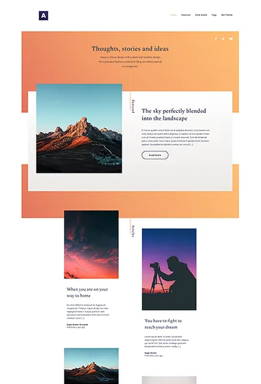
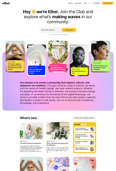
Eihei. Introduce the person and the writing together. An About area sits beside featured essays before the archive opens out below.
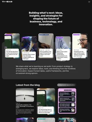
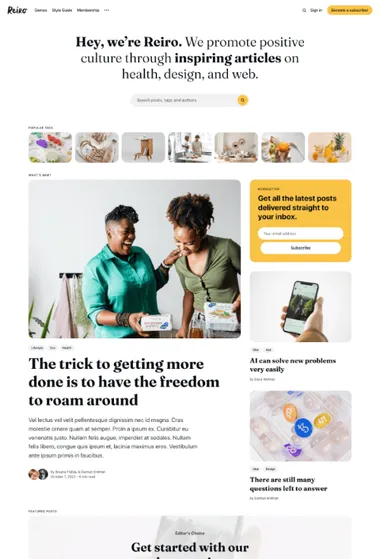
Eihei can place an About area and featured writing below the custom title, with email signup available when free registration is open. New readers can understand whose work they are following before choosing an edition. Spotlight can draw related essays from the primary topic of the first post on each feed page, while flexible article openings make room for both text-led issues and stories that need a stronger image.
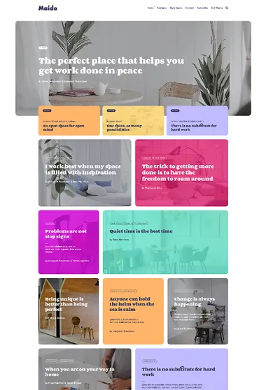
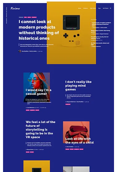
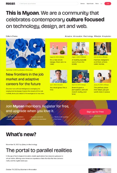
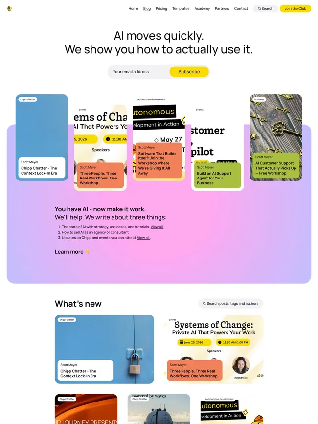
Myoan. Paid tiers can lead the page. An oversized statement and a separate archive keep the offer and the writing visible.
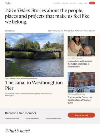
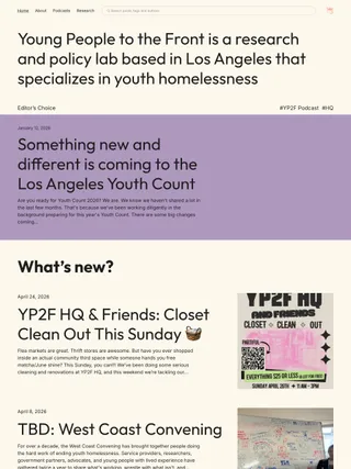
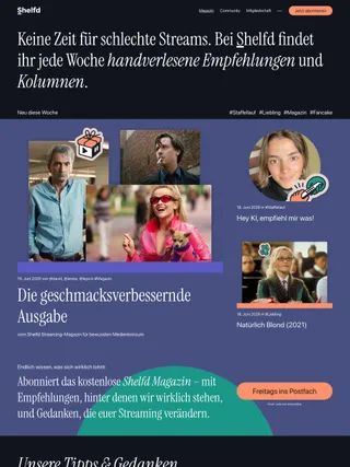
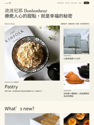
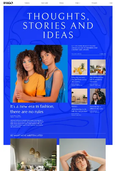
Paid tiers can sit directly beneath Myoan’s oversized statement in place of featured stories. The offer is visible before readers enter the archive, and membership prompts may return between editorial sections or near article endings.
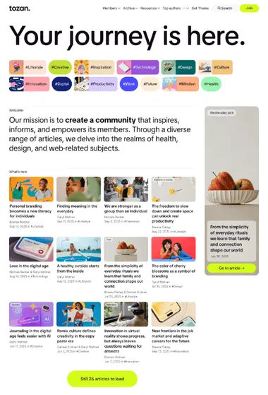
The archive keeps its own editorial character. List and grid feeds move between a spacious run of editions and a denser visual overview. Featured groups can establish the essential reading, while Spotlight can surface stories connected to the first post’s primary topic. Bold type and broad fields of color carry the identity before each edition settles into a quieter reading column.
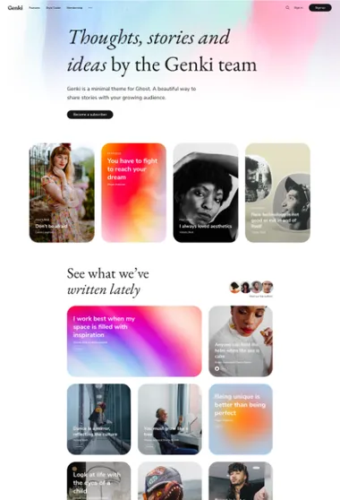
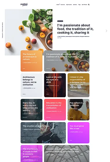
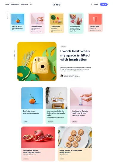
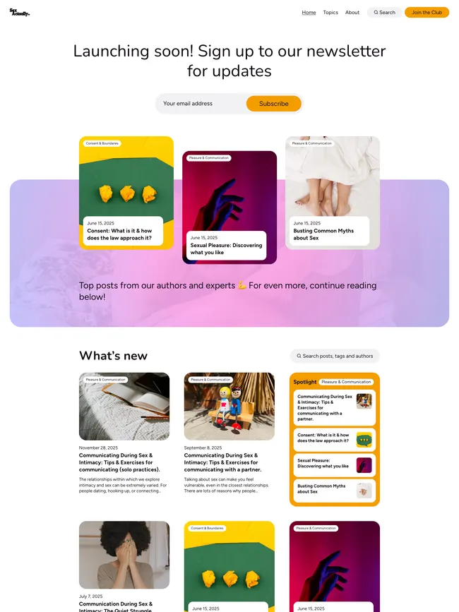
Okiro. Keep a personal newsletter compact and approachable. The newest edition leads, while earlier issues settle into a relaxed grid.
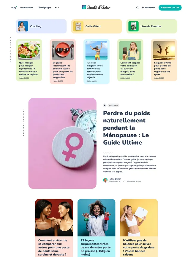
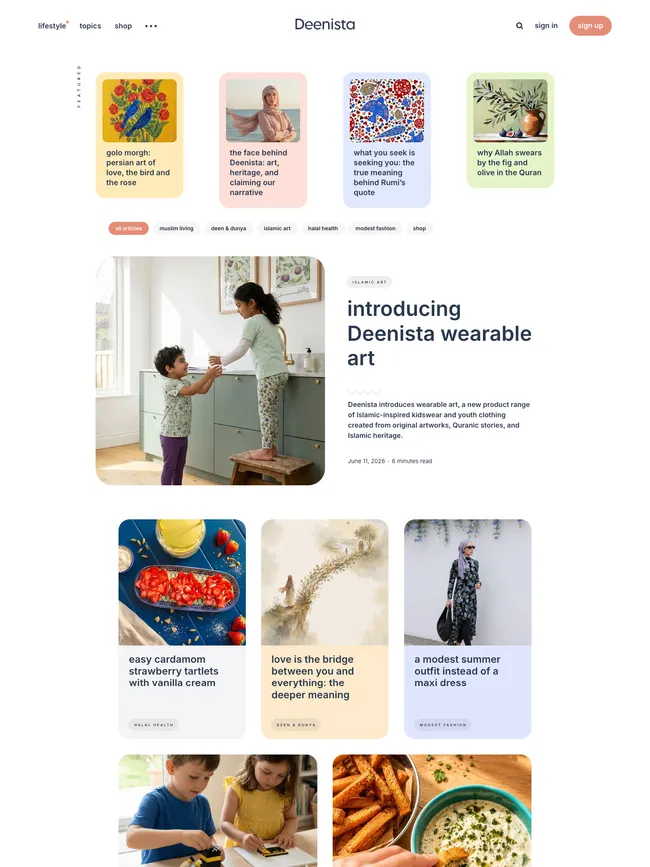
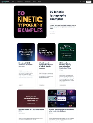
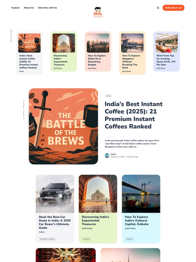
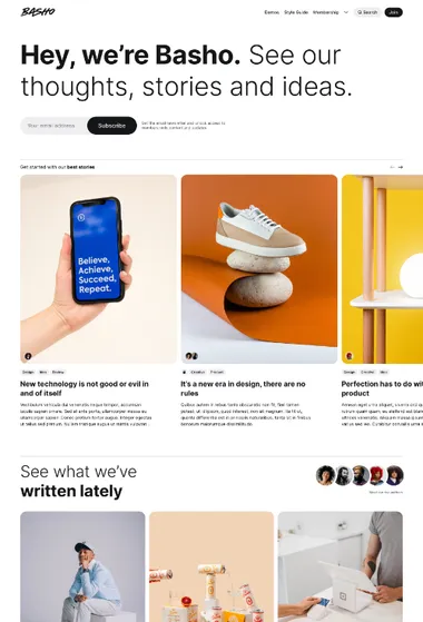
Okiro connects a small newsletter’s archive, signup, and membership in one compact visual system. An email signup can follow the feed and every article. Dedicated Subscribe, Membership, and Account pages cover joining, paid access, and account management, while protected cards use the same rounded forms as public stories.
Featured cards can point new readers to selected editions or a useful starting page. Story-level color can mark a recurring series, making its later editions easier to recognize in the archive.