Ghost themes for magazines
Build a front page with a point of view. Choose how subjects, stories, and membership share the page.
A magazine has to make many stories feel like one publication. The front page establishes what leads today, which subjects return, and where readers can continue once the main story changes.
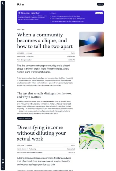
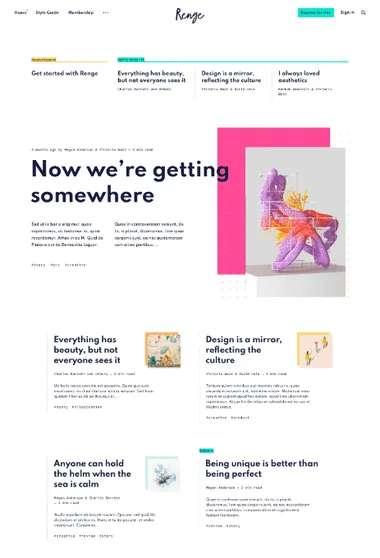
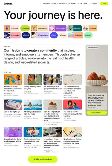
Tozan. Several subjects can occupy the front page at different scales. Lead stories, compact collections, and recurring topics remain distinct.
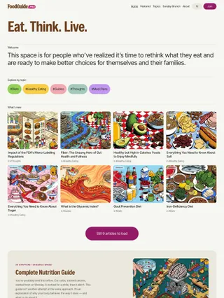
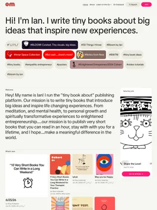
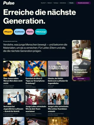
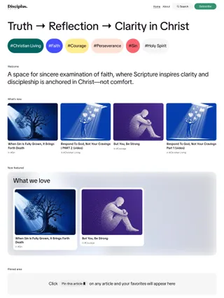
Tozan opens with a large publication statement and topic navigation. The feed moves between lead stories and denser card groups. Saved reading and curated collections add other routes through the archive, and an optional manifesto can close the page.
Topics are treated as editorial destinations, with accents that can extend into collection backgrounds. Image-led stories receive more visual weight than compact text-first lists. Membership pages use the same spacious framing, so subscription remains part of the publication instead of becoming a separate visual system.
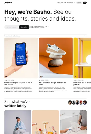
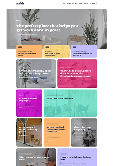
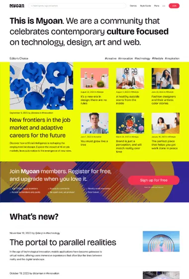
Myoan. The opening can lead with featured stories or paid tiers. Oversized type and asymmetrical story groups give either choice a prominent place.
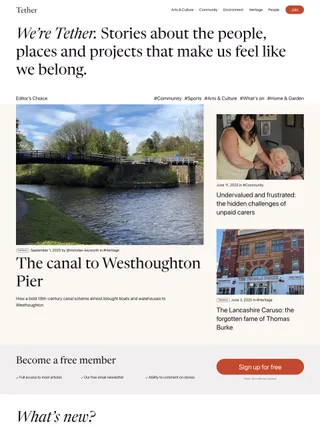
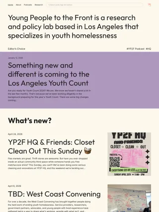

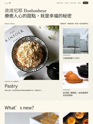
Myoan opens with an oversized statement and gives the next section real visual weight. Featured stories may take that position, or paid tiers can turn membership into part of the opening composition. Subscription prompts can return later without taking over the editorial sequence.
Broad color or image fields frame asymmetrical story groups, then the article pages narrow into calmer reading columns. List and grid feeds change the density of recent work. Spotlight can bring related stories back at a smaller scale. The magazine can move between bold editorial moments and quieter stretches without losing its shape.
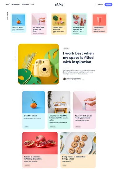
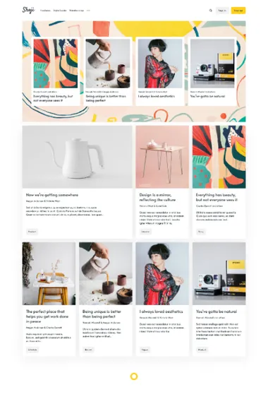
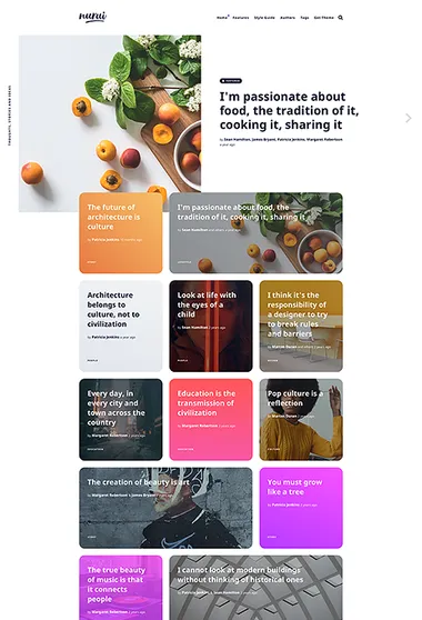
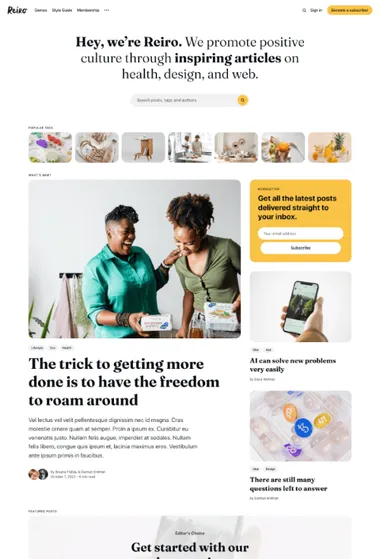
Reiro. Use a familiar magazine rhythm and put discovery first. Topics or authors lead into a prominent story group, a Featured section, and an orderly feed.


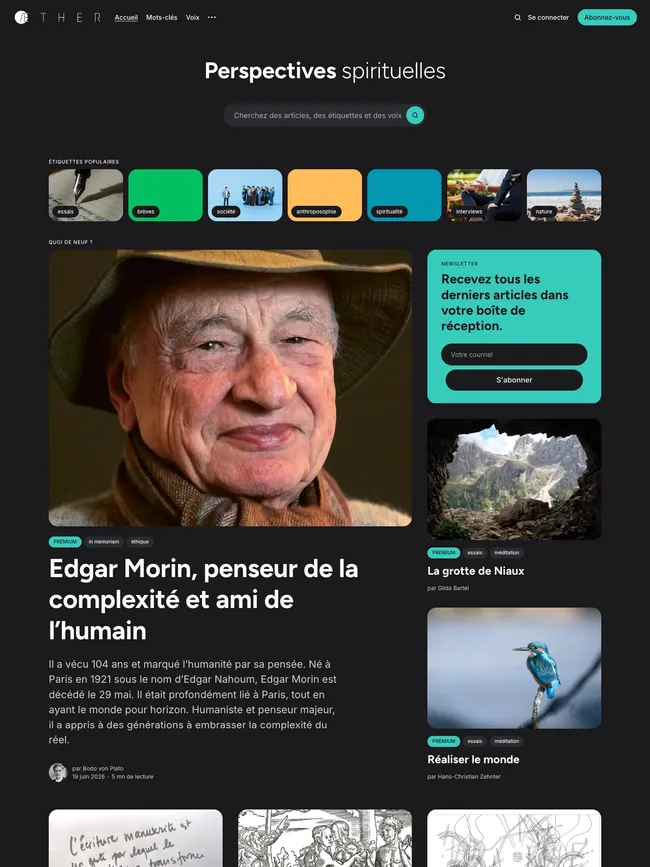
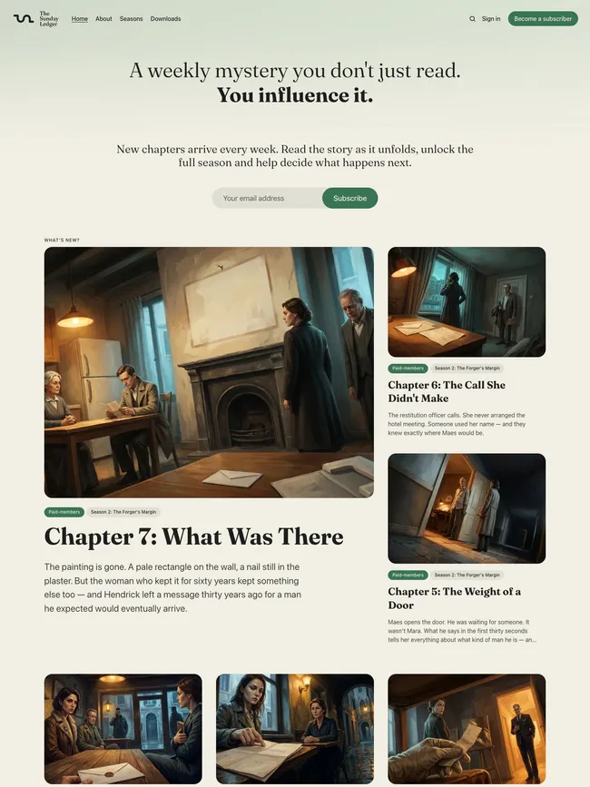
Reiro can begin with topic or author discovery, followed by one prominent lead and its supporting stories. A distinct Featured area can extend the front page before the multi-column feed begins. Rounded cards, small labels, and generous spacing keep the page easy to scan, while subscription stays close to the editorial flow.
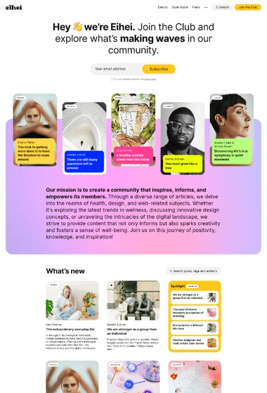
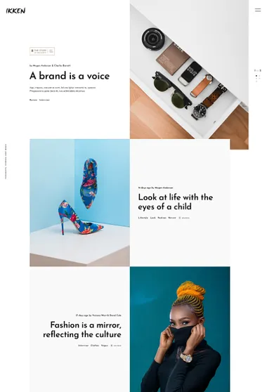
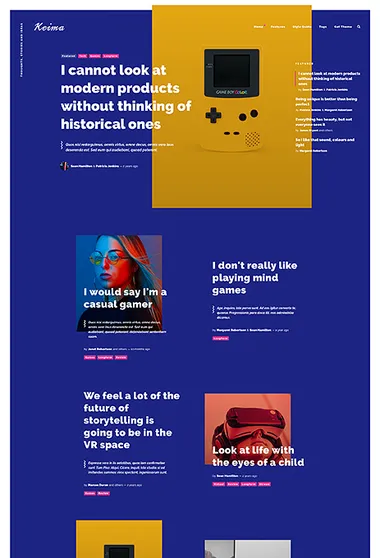
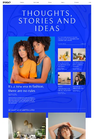
Daigo. Treat the homepage like a magazine cover. Photography, display type, and changes in story scale establish the art direction before the archive begins.
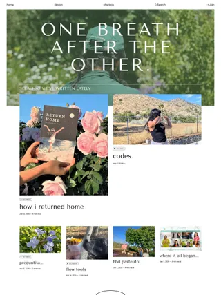
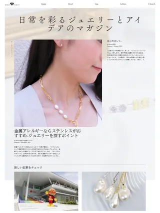
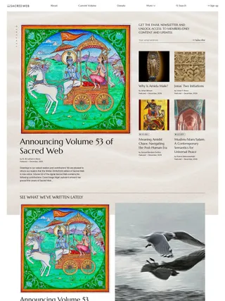
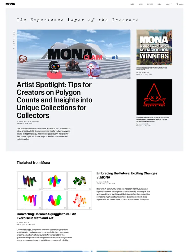
A publication statement leads Daigo’s layered opening, which can place a signup form beside the lead story and supporting selections. The archive then settles into groups of different sizes. Several subjects can share the page without competing as equally weighted cards.
Cover imagery may continue into author and topic pages, giving recurring sections and contributors entrances of their own. Restrained navigation and compact metadata leave photography, illustration, and display type to carry the identity. Color and imagery can change the atmosphere while the cover-led hierarchy stays intact.
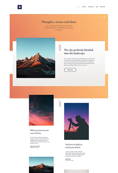
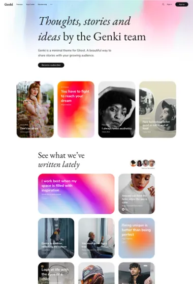
Genki. A magazine led by writers can put its contributors in view. The author group can appear between selected work and the regular feed.
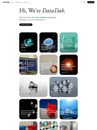
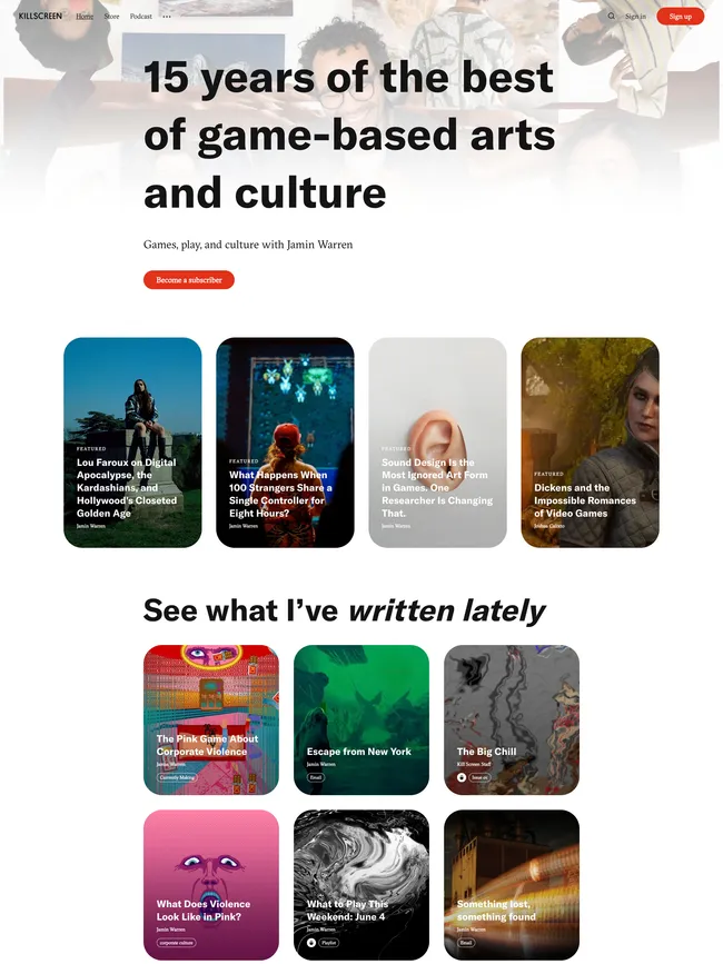
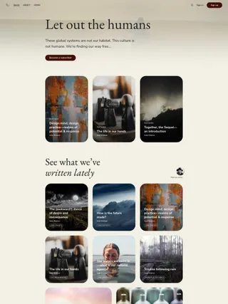
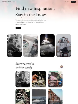
Featured pages and posts appear in separate groups, so standing material and current selections can take different roles. Cards can change scale or place their titles over imagery, while article openings decide whether type or image should lead.