Ghost themes for blogs
Give every post a place. Keep new writing, recurring subjects, and older posts easy to explore.
Every new post changes the front page. A good blog theme keeps the latest writing prominent while giving recurring subjects, featured posts, and older work reliable ways back into view.
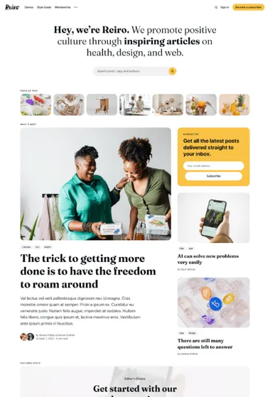
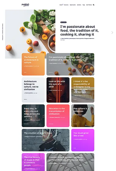
Reiro. A broad blog can still feel easy to enter. Topics or authors can appear before a layered story selection and the regular feed.

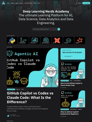
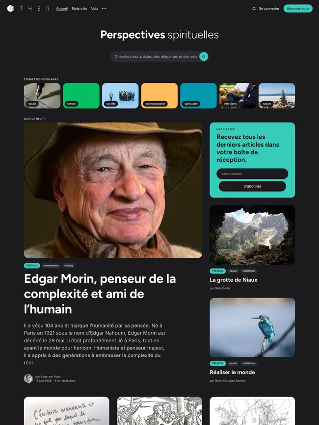
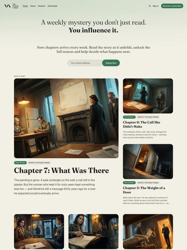
For a blog with several subjects or contributors, the visual strip gives readers a way to browse before they reach the lead story. Supporting posts, a separate Featured section, and the regular feed keep established work visible alongside new entries.
Rounded cards and compact labels make the larger archive easy to scan. Dedicated author, tag, and featured pages add more routes through it. Inside an article, the optional sidebar can keep the writer, another editorial pick, and a subscription prompt nearby while the central column stays focused on the story.
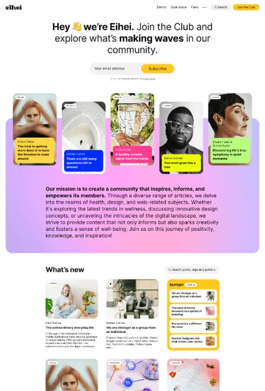
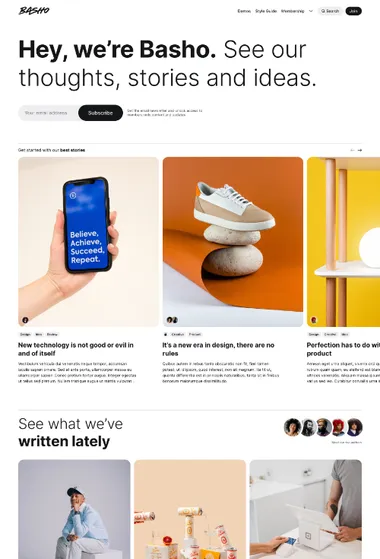
Basho. Put the writers near the front. A compact author group and moving run of featured stories give a shared blog a recognizable cast.
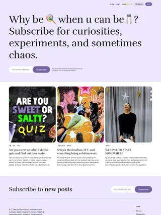
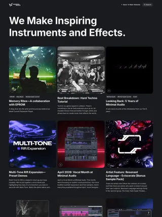
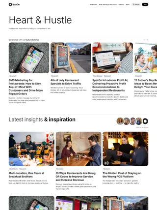
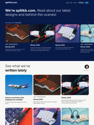
Basho can bring the most active writers into view above the archive. Featured posts can move through a horizontal slider, then regular publishing resumes in an orderly image-led grid. Independent image proportions and several article openings let different contributors set a pace of their own without breaking the shape of the shared blog.
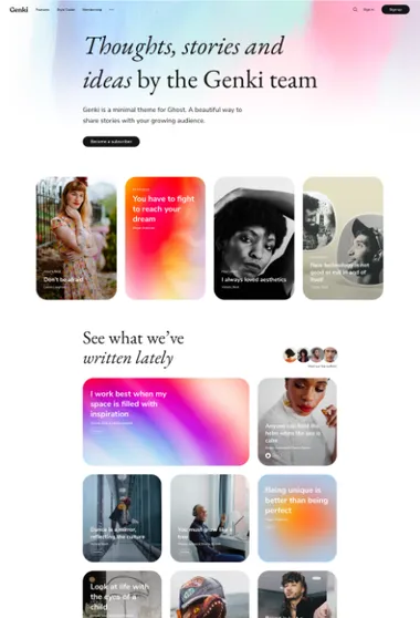
Genki. Let the blog introduce itself in words. A large statement sets the voice before selected work and the latest posts enter the page.
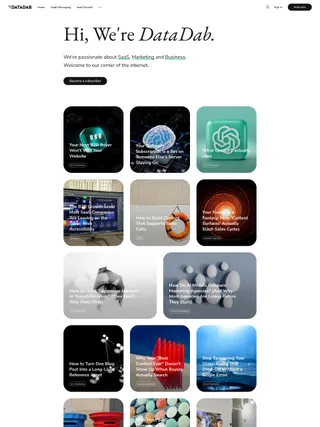
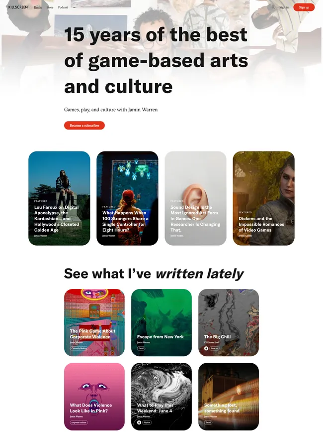
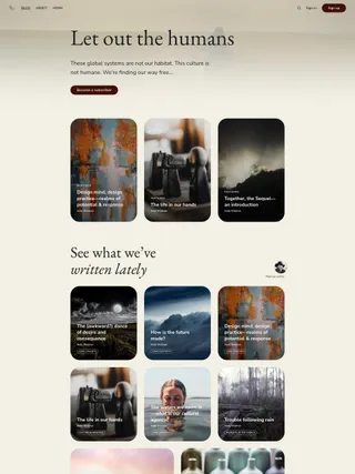
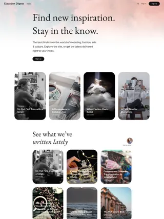
Featured pages can hold an introduction or other enduring material, while featured posts mark selected entries before the latest feed. An occasional larger card interrupts that feed when one piece deserves more room.
Article openings may be led by the headline, the feature image, or a balance of both. A compact author group can make the contributors visible, and recommendations can reconnect the newest entry with an existing subject.
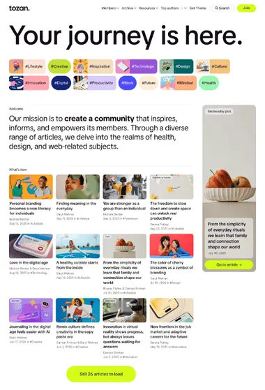
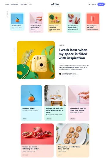
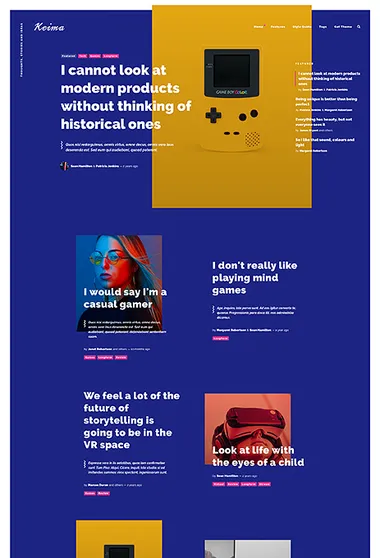
Okiro. Keep regular publishing light on its feet. Compact featured cards lead into one prominent new story and a relaxed grid.
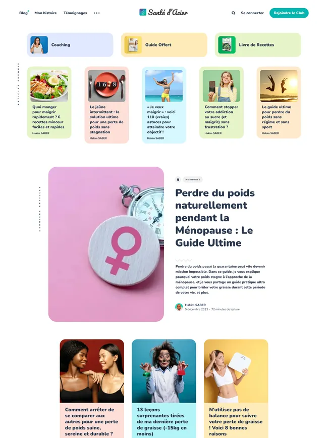
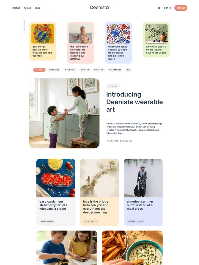
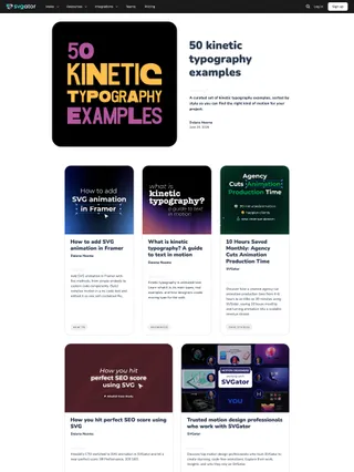
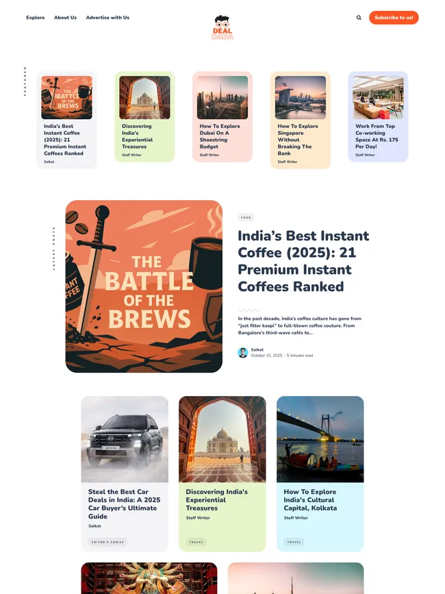
Okiro makes the shape of the blog clear at a glance. Compact featured cards introduce selected posts or pages, the newest story takes the larger opening, and earlier entries settle into a rounded grid. Color can mark a recurring subject or give one post more presence. Recommendations and related posts provide a simple route back into the archive.
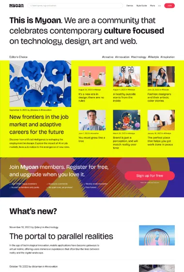
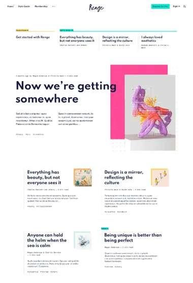
Renge. Let the newest post change the mood of the page. A poster-like opening gives way to a smaller, more typographic archive.
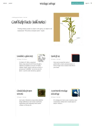
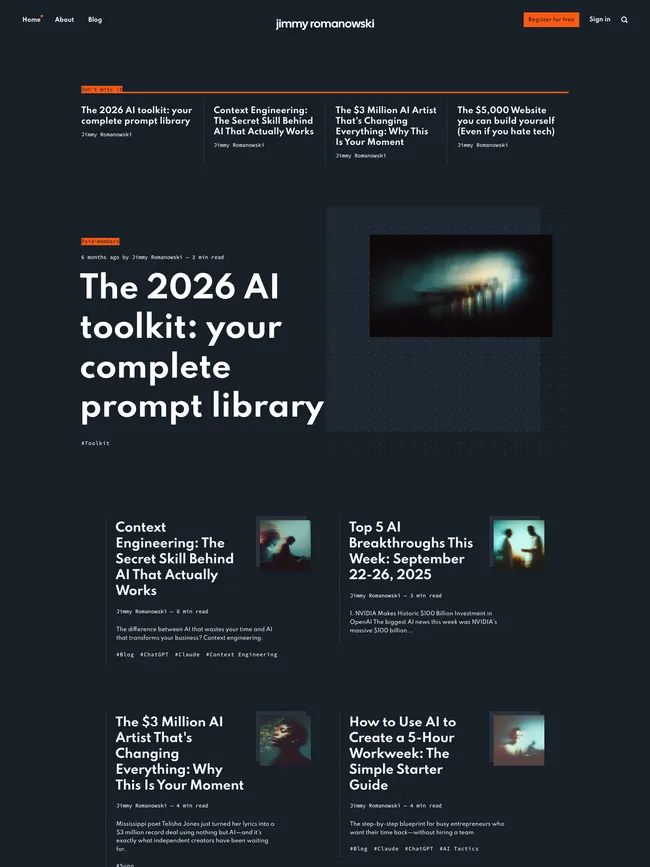
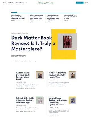

Renge turns the newest post into a poster-like opening through oversized type, an offset image, dotted fields, and layered color. The archive then contracts into compact, text-led groups. Regular publishing stays concise while the latest story receives a presentation of its own.
Featured pages can hold announcements, and featured posts form a separate selection above the feed. Color may belong to one card, continue through an article, or reshape the publication background. Occasional pieces can break the routine without changing the everyday format of the blog.
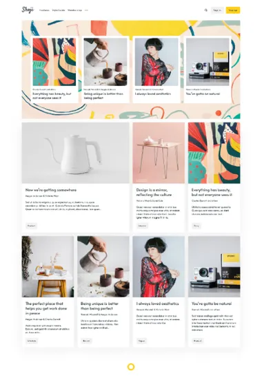
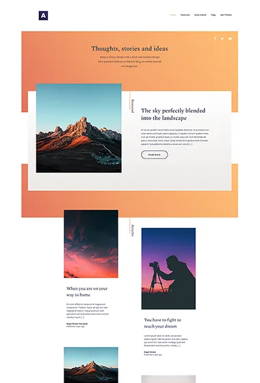
Shoji. Selected work and new posts have separate places. Optional author and topic groups give readers other routes through a growing archive.
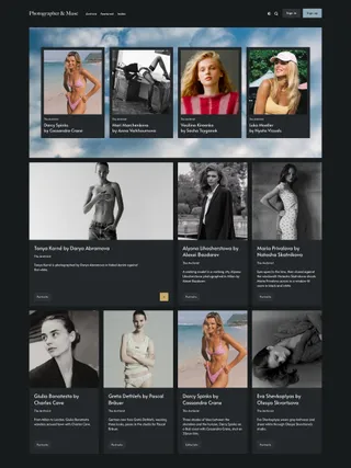
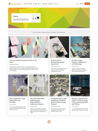
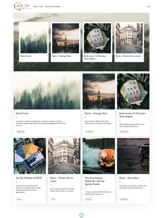
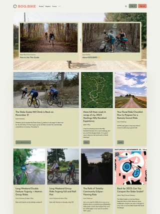
Shoji organizes the homepage as a series of framed sections. Selected pages and posts sit near the top, the latest story opens at a larger scale, and a compact archive follows. Recommendations can bring an established subject back after the main feed, so new, highlighted, and related material remain easy to distinguish.
Author and topic groups can follow the feed and lead into dedicated directories. Subscription and membership use the same framing. As contributors and subjects multiply, they join an existing pattern instead of competing for one undifferentiated grid.
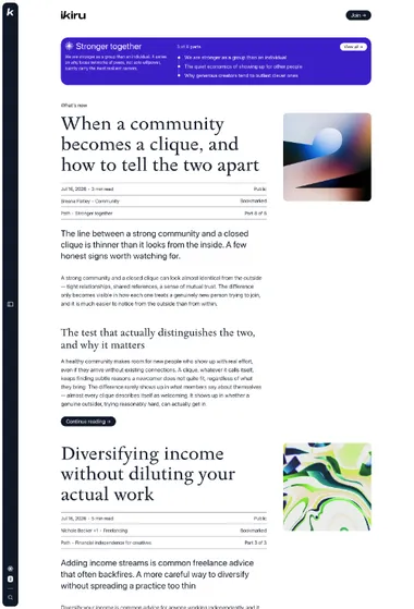
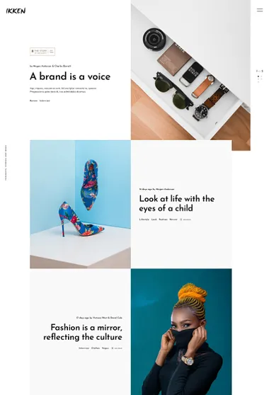
Ikken. Build the blog as a sequence of image-and-text spreads. Each post receives room before the next one enters the frame.

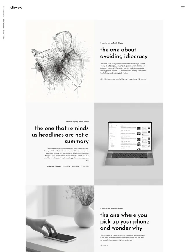
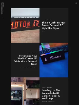
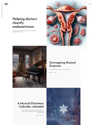
Ikken treats a blog as a sequence of editorial spreads. A full-scale featured opening gives selected pages or posts room to lead, then image and text trade sides through the feed. Wider and image-free entries interrupt the pattern. Navigation, popular topics, and optional author discovery stay inside the expandable panel, leaving the homepage open for the photography that sets its pace.