Ghost themes for editorial publishing
Decide what leads, and what follows. Build the hierarchy through story scale, recurring sections, and distinct article openings.
Editorial publishing is shaped less by subject than by decisions about emphasis. The homepage sets those priorities, and each article carries them into the reading experience.
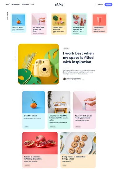
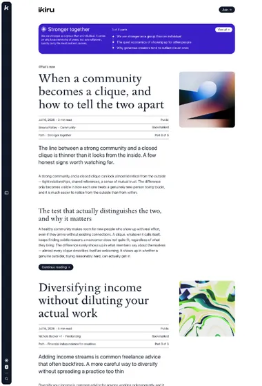
Ikiru. Let the reading begin on the front page. Extended previews, guided Paths, and a quiet side rail turn sequence into an editorial choice.
Ikiru brings part of a post onto the homepage, so a reader can enter through the writing itself. Featured posts and Paths interrupt that measured flow only when a story or sequence deserves a stronger place in it. Typography, spacing, and the movement from one piece to the next carry the hierarchy.
A Path gives essays, serial writing, or a themed collection its own introduction and reading order. The side rail keeps these routes close to navigation, search, and saved articles. Inside a longer piece, the table of contents, progress indicator, related stories, and previous or next links help the reader keep going.
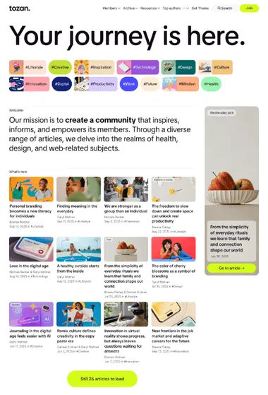
Tozan. Assign different roles to stories on a large front page. Lead pieces, curated groups, and compact lists make editorial priorities visible.
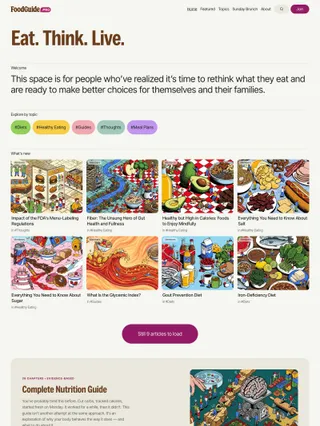
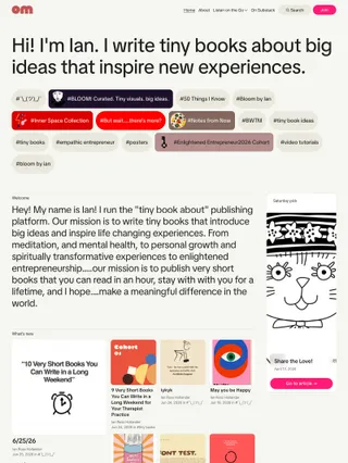
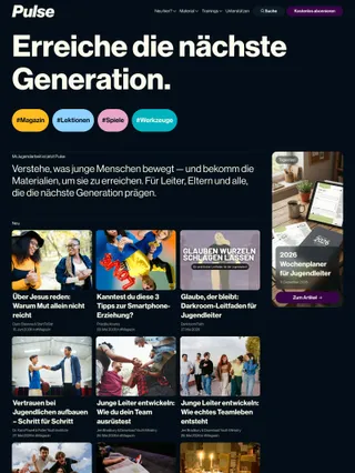
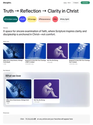
Tozan opens with the publication’s statement and topic navigation, then assigns different roles to lead stories, selected work, saved reading, and denser groups of posts. Optional Welcome and Manifesto sections add context at opposite ends of the page, away from the regular feeds.
Changes in scale keep a broad editorial mix legible. A lead story can dominate, image-led cards can introduce a subject, and compact text groups can carry more of the archive. Topic accents give recurring subjects their own identity, while article openings adapt to the material before settling into focused reading.
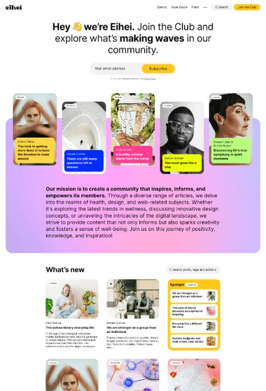
Eihei. Introduce the publication beside its featured stories. An About area sets the context before the regular card grid begins.
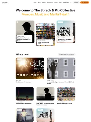
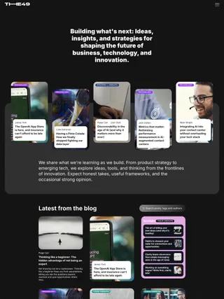
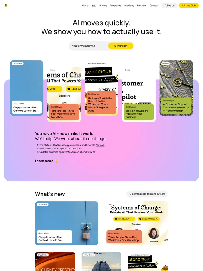
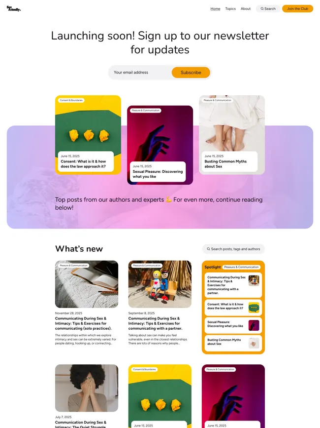
Spotlight can draw related writing from the primary topic of the first post on each feed page, adding a second route through the archive. Article openings change the balance of text and imagery from story to story, then return to the same focused reading environment.
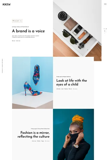
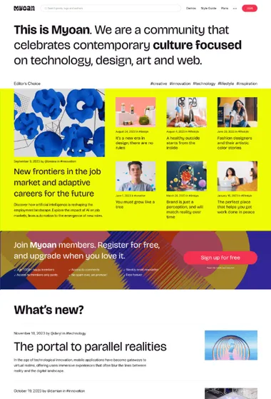
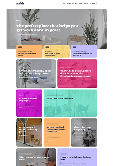
Myoan. Make the hierarchy visible at a glance. Oversized statements, asymmetrical story groups, and broad fields of image or color create a bold editorial cadence.
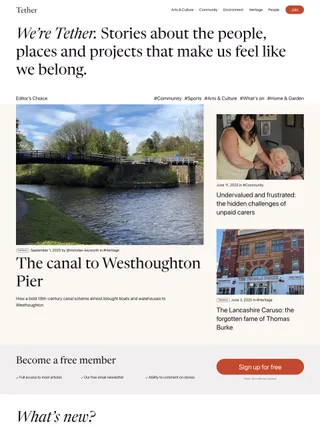
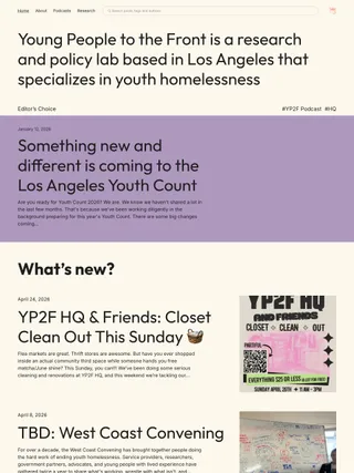

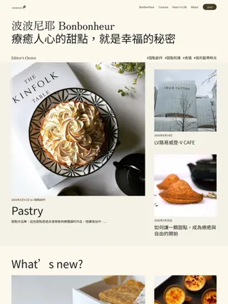
Myoan uses strong changes in scale to separate editorial moments. The opening statement may lead into featured stories or paid tiers. Editor’s Choice gives one story more weight than its supporting cards, and a broad field of color or imagery holds the group together.
The feed can be a linear list or a more visual grid, while Spotlight can return to related work at a smaller scale. Article openings change the balance of headline, image, width, and background before narrowing into quieter reading. Membership has its own presence within the composition, so it remains visible without defining every section.
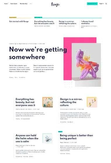
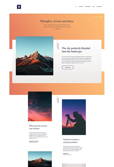
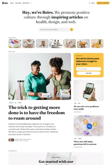
Reiro. Begin with familiar magazine cues. Topics or authors lead into a prominent story group, a distinct Featured section, and an orderly feed.


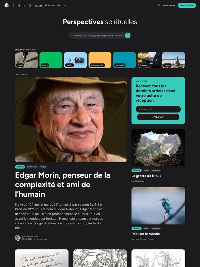
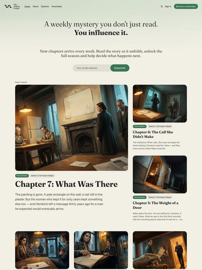
Reiro moves from selected topics or contributors to a dominant story with supporting posts, a contained Featured area, and the regular archive. Shifts in scale establish the priorities. Rounded cards and generous spacing soften the transition from the composed opening into the feed.
Articles narrow from broad headlines and imagery into focused reading. An optional sidebar can hold author context, another editorial pick, and a subscription form. Readers can enter through a subject, contributor, featured story, or the regular archive.
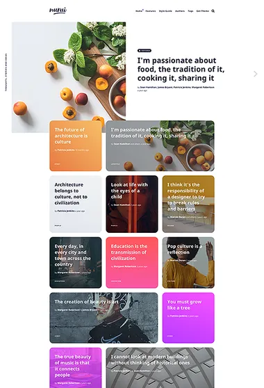
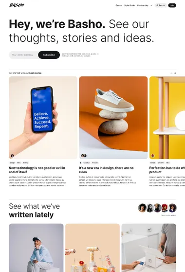
Basho. Build the front page from a few clear stages. A typographic introduction, moving featured stories, visible contributors, and a regular grid establish the order.
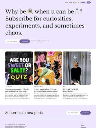
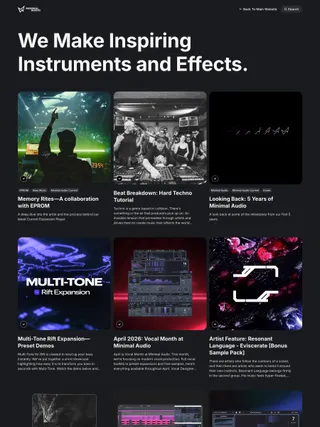
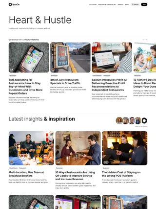
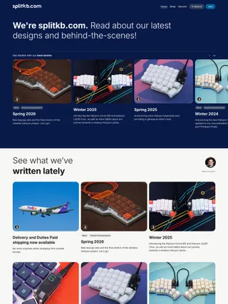
A large publication statement sets the tone, the featured-story slider keeps lead pieces in view, and the regular feed establishes a steady pace for everything that follows. Independent image proportions and several article openings create variation from story to story. Color can frame the introduction and subscription areas while the central reading surfaces remain restrained.
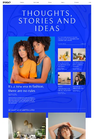
Daigo. Treat the homepage like a cover. Oversized type, layered imagery, and strong differences in story scale turn the opening into one visual composition.
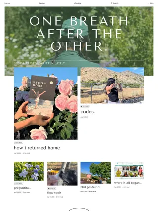
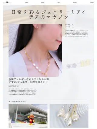
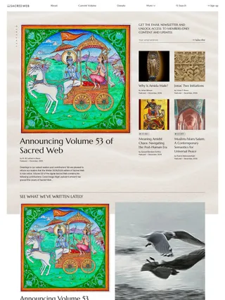
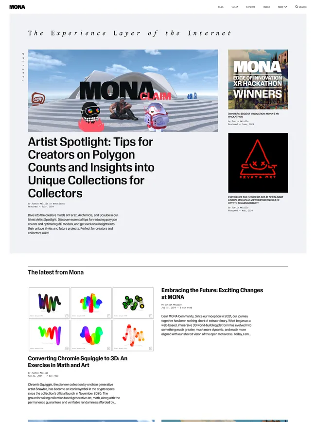
One story leads, smaller selections establish context, and a recommendation shelf can return an important subject later on the page. Changes in scale show what to enter first and what should remain visible after the lead story changes.
That judgment continues inside each story. Introductions range from quiet text-led arrangements to image-backed or full-image compositions, with color available for pieces that need their own atmosphere. Photography helps determine a story’s rank, tone, and first impression.
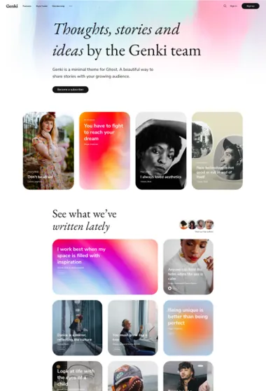
Genki. The grid can shift emphasis without changing its overall order. Larger cards and typography-led article openings set selected stories apart.
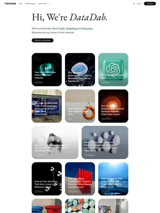
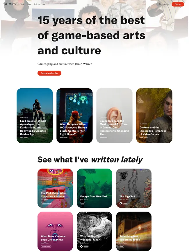
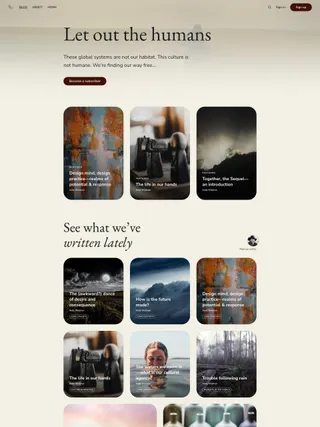
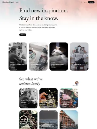
Featured pages and posts can occupy separate places before the feed, with an optional author group near the latest stories. A larger card or a title placed over an image can single out a story without changing the whole grid. Articles can then open with type, imagery, or both.
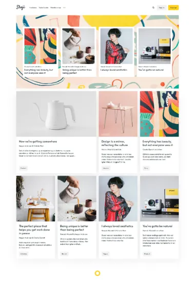
Shoji. Give each section one job. Featured content, recent stories, discovery, and membership stay distinct within the same framed system.
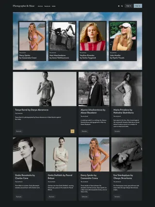
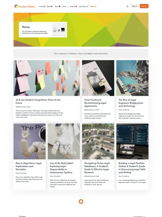
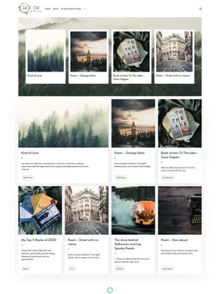
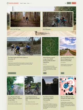
A broad, image-backed area holds selected material. Current stories move through a systematic grid, and recommendations reopen an established subject after the main sequence. The modules can share a long front page because their roles remain separate.
Article pages simplify the composition. A story may begin as a split layout or beneath a broad image, then settle into a quiet reading column. Author and topic directories, subscription, and member pages reuse the same framing across the rest of the site.