Ghost themes for company sites
Give the brand a publishing voice. Keep product news, expert voices, and ongoing work in one place.
A company becomes easier to understand when its site shows the work in motion. Product updates, specialist knowledge, and stories from the team can carry more context than a static introduction alone.
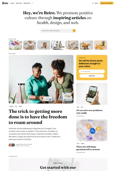
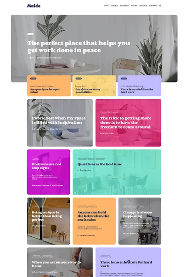
Reiro. Bring several subjects and contributors under one company voice. Readers can enter through an area of expertise before moving into current and featured stories.
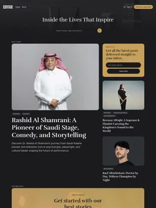
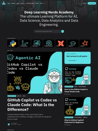
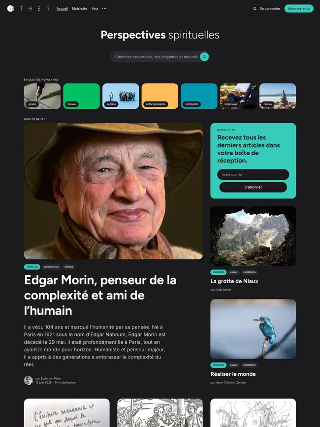
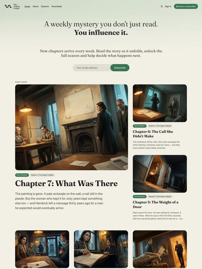
For a company with several specialists, the topic or contributor strip can place established expertise ahead of the latest update. A weighted lead group shows the current focus, while the optional Featured section and regular feed keep longer-lived material available.
Topic, author, and article pages keep research, product thinking, and company updates connected as the archive grows. Individual specialists can remain visible, or author details can recede when the company needs one editorial voice.
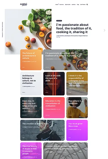
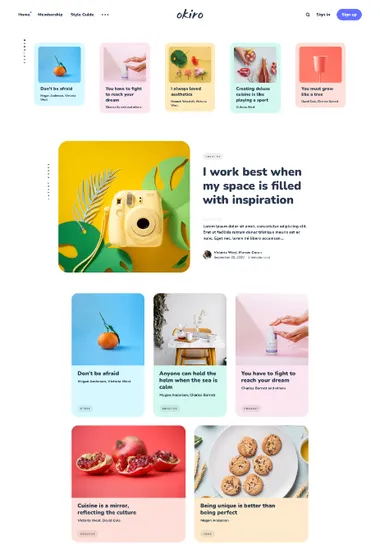
Okiro. Regular company updates stay close to the essential pages. The newest story leads a compact archive, with room for color to distinguish a series.
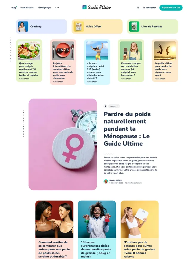
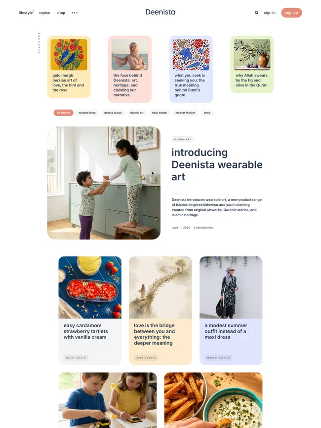
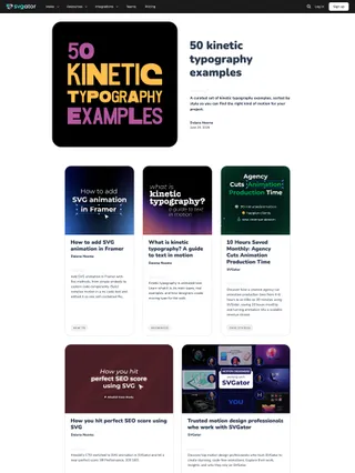
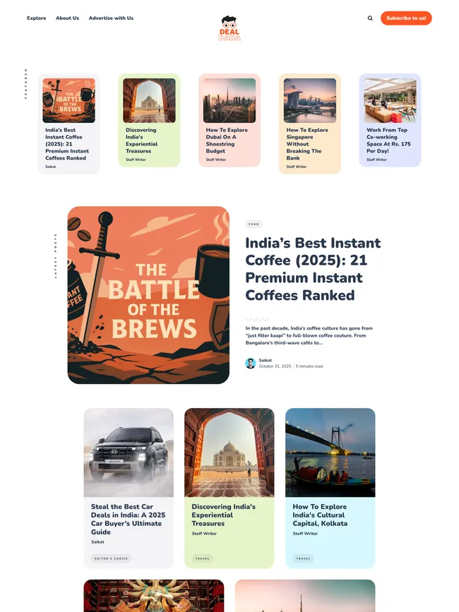
Okiro keeps product notes, ideas, and regular company updates on a compact front page. Featured cards introduce key pages or selected stories, the newest article receives the broadest treatment, and earlier posts settle into a rounded grid. Color can mark a recurring series while the rest of the brand stays consistent. Team voices may remain visible or give way to a single company voice.
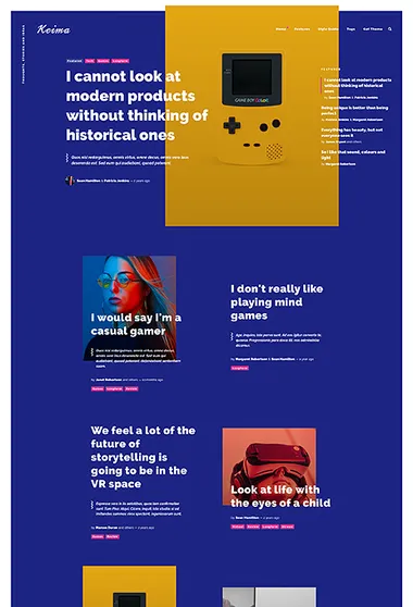
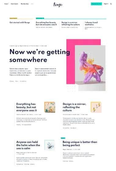
Renge. Carry the company’s visual identity into every update. The latest story becomes a poster-like composition, while color can change from one release to the next.
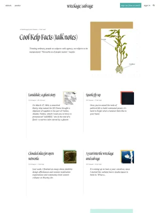
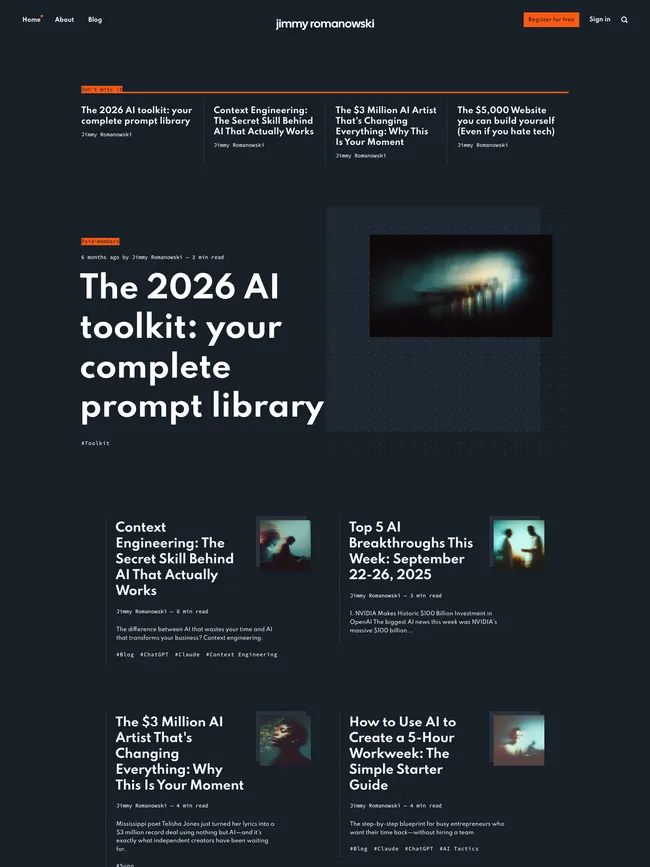
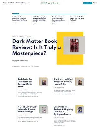
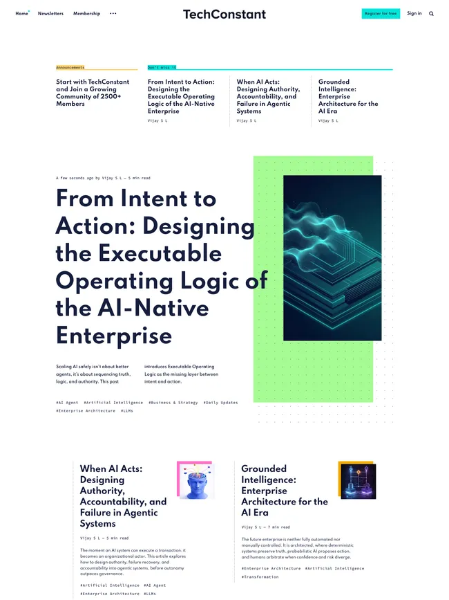
A launch, studio note, or cultural essay can receive its own card or article color in Renge. The wider publication background may also shift when a campaign needs a stronger treatment. The typographic hierarchy and compact archive stay recognizable across those changes.
Featured pages can hold announcements, and featured posts form a separate editorial selection. The newest company story then takes the poster position through an oversized headline, offset imagery, and dotted detail. Updates feel connected to the brand, yet each release has room to establish a character of its own.
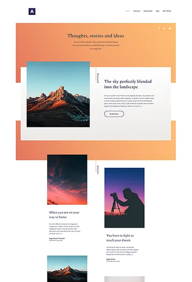
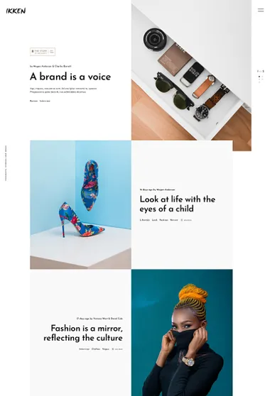
Ikken. Let products and projects carry the company story through images. A full-screen featured opening can lead into an alternating sequence of visual updates.
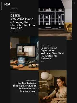
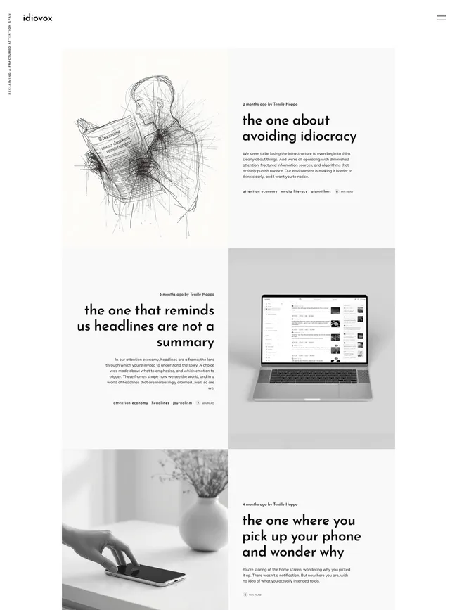
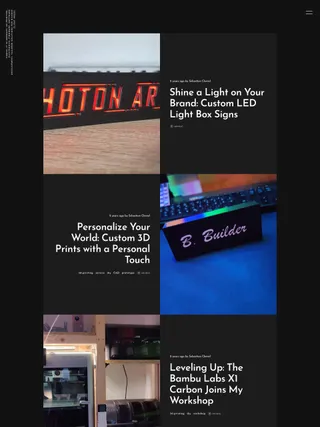
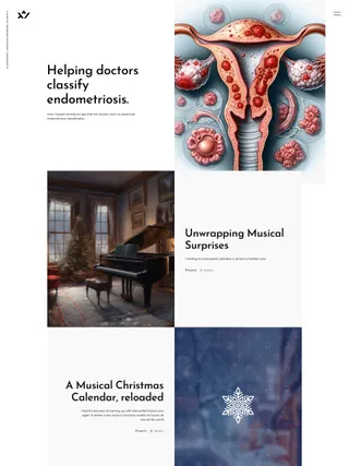
Featured pages and posts share Ikken’s full-scale opening, so a company introduction, collection, or key project can sit beside current launches. The feed below alternates image and text like a sequence of editorial spreads. A wider entry can interrupt the pattern when one story needs more room.
Product photography, campaign imagery, or project documentation carries the visual identity. Popular topics and optional author discovery remain inside the expandable panel instead of becoming another permanent homepage block. Author details can stay for named expertise or disappear when the company should speak with one voice.