

Ghost themes for magazines
Distinct ways to publish. Find the structure that fits your editorial direction.
A magazine theme brings different stories together as one recognizable publication. Clear hierarchy, recurring sections, and a consistent visual language help readers understand what matters now and what to explore next.
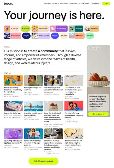
Tozan. For structured, multi-topic publishing. Prominent stories, compact collections, and recurring subjects form a clear magazine hierarchy.
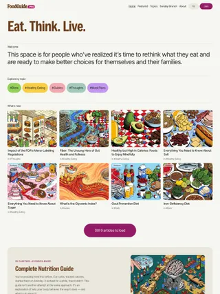
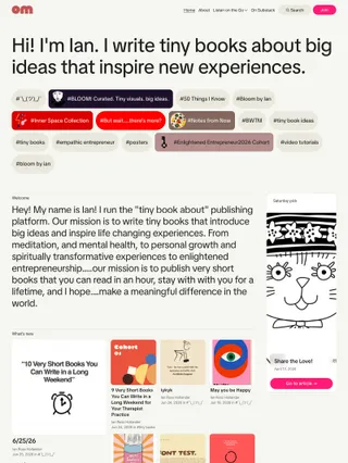
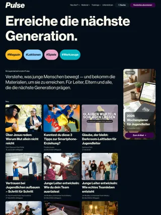
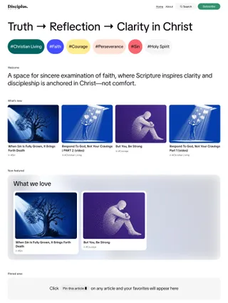
Tozan provides a broad editorial framework for magazines built around several subjects. Its homepage can move from an oversized publication statement and topic navigation through lead stories, denser card groups, curated collections, saved reading, and a closing manifesto. Shifts in scale and spacing give each area a different role, so the front page can lead with what matters now while keeping older work in view.
Topics act as editorial destinations rather than simple metadata. Tag colors can expand into the background of a collection, while a mix of image-led cards and compact text-first lists makes a large archive easier to scan. Typography, imagery, and appearance settings can move the mood from restrained to expressive, but the structure remains suited to magazines covering several subjects, contributors, and recurring sections.
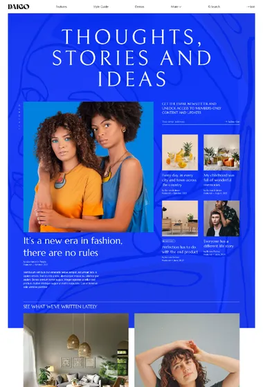
Daigo. For image-led magazines with strong art direction. A layered, cover-like homepage carries its visual rhythm into individual stories.
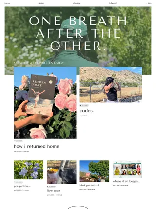
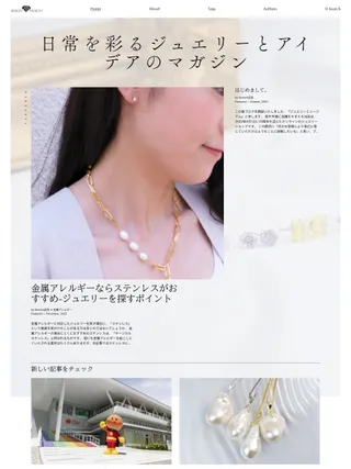
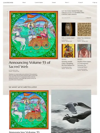
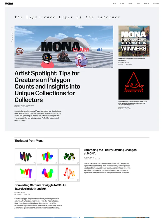
Daigo lets imagery set the pace. An oversized publication statement, one lead story, supporting selections, and a subscription surface form a layered opening before the regular feed. Larger and smaller story groups continue the hierarchy below, so photography, art, fashion, architecture, or culture can shape the publication’s identity without every card competing at the same scale.
That cover-led language extends to author, tag, and article openings. Eight post headers change how the headline, feature image, background, and color meet, while restrained navigation and compact metadata keep them dominant. Cover imagery and opacity can shift the mood from quiet and print-like to vivid or dramatic. Daigo fits magazines that want each major story to have its own visual entrance.
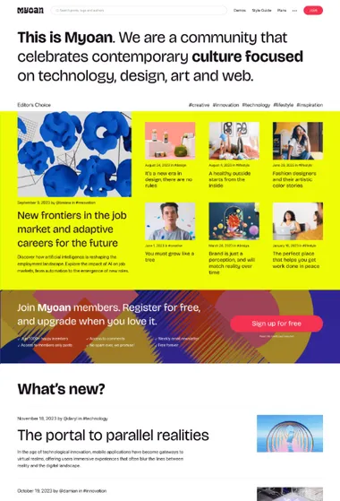
Myoan. For magazines where membership shapes the experience from the start. Bold editorial sections and flexible feeds keep subscription choices visible without pushing stories aside.
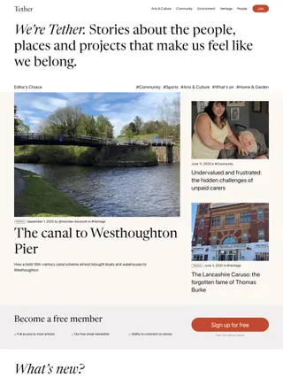
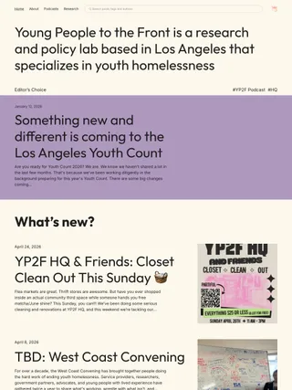
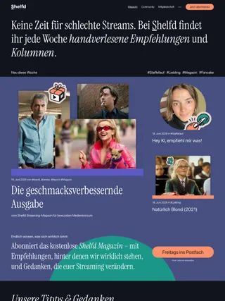
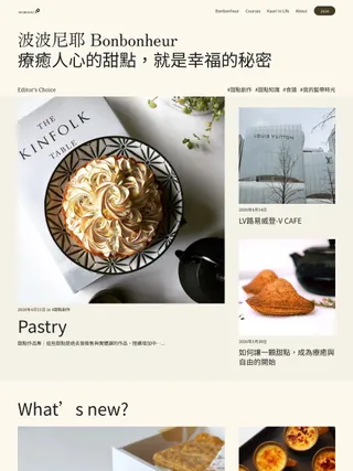
Myoan can open with selected stories or place paid tiers directly beneath an oversized publication statement. That choice makes membership part of the initial composition rather than a separate destination. Subscription prompts can return between editorial sections and near article endings, creating a consistent path to join while the content remains central.
Its visual identity comes from contrast: large typography, broad color surfaces, strong image areas, asymmetrical featured groups, and quieter reading columns. List or grid feeds adjust the density of recent stories, while a compact Spotlight collection or a larger recommendation brings related work back into view. Myoan suits magazine-style publications that want discovery, visual expression, and subscriptions to share the same system.
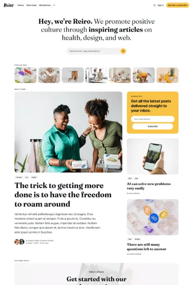
Reiro. For a classic magazine rhythm with discovery up front. A substantial hero and visual topic or author navigation lead into featured stories and an orderly feed.
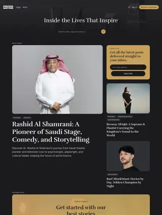
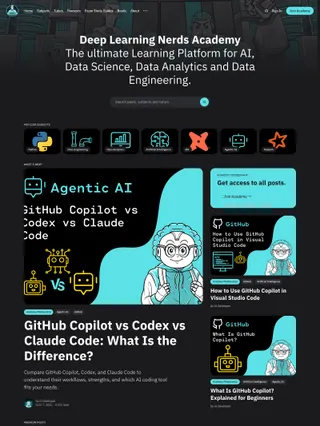
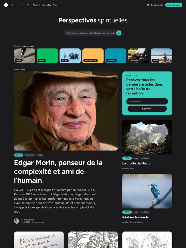
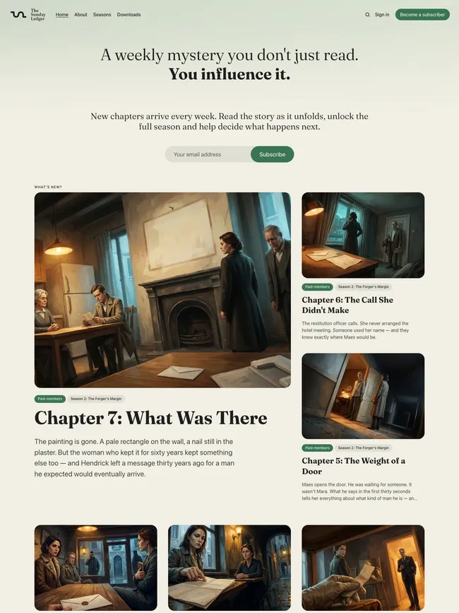
Reiro opens with a familiar editorial hierarchy. A visual strip of selected tags or authors appears before the main stories, followed by one prominent lead, smaller supporting posts, a distinct Featured section, and a regular multi-column feed. Each area has a clear role, giving readers several routes into the content without turning the homepage into a highly graphic composition.
Rounded image-led cards, strong headlines, small labels, and generous whitespace keep content-rich pages structured rather than dense. Accent color stays concentrated in featured areas, callouts, and subscription panels, allowing the rest of the publication to remain calm. Reiro fits magazines and multi-topic, author-rich publications that want familiar discovery and membership tools close to the editorial flow.
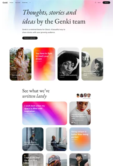
Genki. For writer-led magazines where typography carries the identity. A strong publication statement gives way to selected stories, pages, and contributors before the main feed.
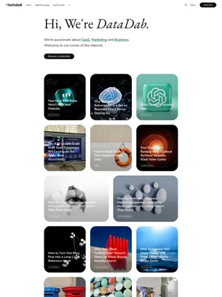
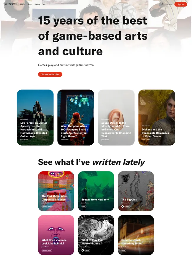
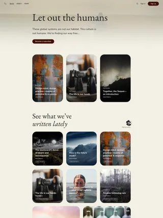
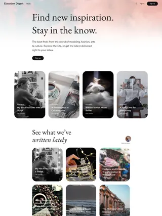
Genki gives writing a visual presence without adopting the scale of a large magazine front page. A substantial homepage statement leads into separate sections for featured posts and pages, followed by an author spotlight and the latest stories. Individual cards can grow larger or move their title over imagery, changing the pace around selected work while the overall rhythm stays personal and measured.
Article openings continue the same balance. Seven header layouts decide whether the headline, feature image, background, or a combination of them should lead before the page narrows into reading. The automatic author spotlight keeps the people behind the publication visible without adding another large section. Genki suits independent, writer-led magazines that want typography and imagery to share the editorial voice.